
A kitchen tool set can look good as a product and still not feel fully ready for retail.
This happens more often than many brands expect. The tools may be useful. The materials may be acceptable. The colors may look current. But once the set is placed in a supermarket aisle, a department store shelf, or a home goods display, small questions begin to appear.
Does the set make sense quickly? Can the customer understand why these tools belong together? Does the packaging protect the pieces and also present them clearly? Does the color story feel like one line, or just a group of items placed in the same box?
For buyers, retail-ready kitchenware is rarely about one big decision. It is usually the result of many smaller decisions working together.
A Good Product Is Only Part of the Shelf Story
The product itself still matters most.
A weak spatula, loose tong, or uncomfortable ladle will not become a strong retail item just because the packaging looks better. But in retail channels, product quality is only one part of the shelf story.
Retail buyers often look at a kitchen tool set from several angles at once. They think about the product mix, the price point, the packaging format, the visual identity, the way the set sits on the shelf, and whether consumers can understand the offer in a few seconds.
That last part is easy to underestimate.
Online, a product page gives space for photos, descriptions, bullet points, videos, reviews, and comparison charts. In store, the product has much less time. A customer may glance at the shelf, notice the color, read one phrase on the box, and move on.
This is why retail readiness is not only a packaging issue. It is a product communication issue.
The set has to explain itself before anyone studies the details.
The Set Needs to Make Sense Quickly
Some kitchen tool sets feel random.
They include many pieces, but the logic is not clear. A spatula, a whisk, a ladle, a peeler, and a brush may all be useful individually, but together they may not tell a simple story.
Retail buyers usually prefer a set that has a clear use case.
For example, a daily cooking set might include a spatula, spoon, ladle, turner, and tongs. A baking-focused set may include a spatula, whisk, brush, scraper, and measuring tools. A compact kitchen set may focus on nesting, hanging, or smaller footprint.
When the product combination is clear, the consumer does not need to think too hard.
For a retail set, the basic questions should be easy to answer. What is the set for? Who would use it? Does it fit the customer’s kitchen? Does it feel like good value without needing too much explanation?
This matters for private label kitchen tools, especially when the buyer is building a full line. The set should not feel like an assortment created only to increase piece count. It should feel like a product family designed around real kitchen use.
At L-Tools Industrial & Development Co Ltd, retail-ready discussions often start before packaging is finalized. One thing we notice is that the product mix itself often decides how strong the packaging can become later.
If the set logic is weak, packaging has to work too hard.
Packaging Carries More Weight Than Many Brands Expect
Kitchenware packaging has two jobs.
It has to protect the product. It also has to present the product.
Many packaging problems start when one of those jobs is treated as more important than the other. A beautiful color box may look good in a proposal but fail during shipping. A very protective box may keep the tools safe but hide too much of the product from retail customers.
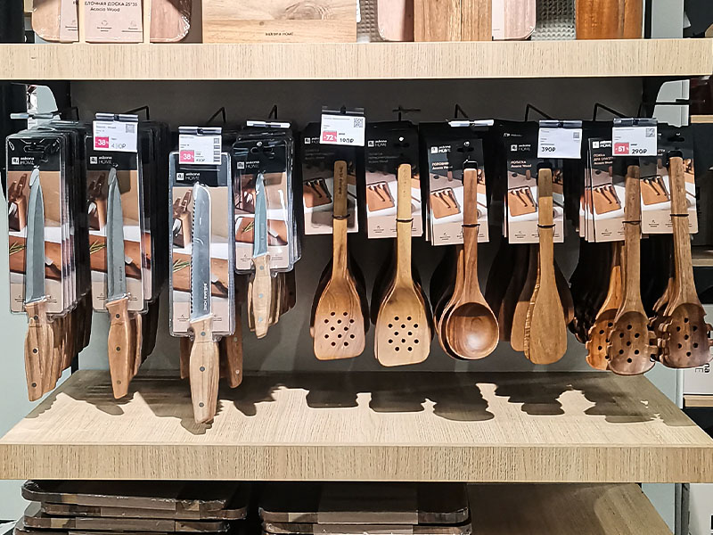
For kitchen tools, common packaging formats include hanging cards, color boxes, sleeve packaging, open display boxes, PDQ displays, display trays, and gift boxes. Each format changes how the product is understood.
The format choices are usually practical rather than decorative:
• hanging card
• color box
• sleeve packaging
• open display box
• PDQ display
• display tray
• gift box
A hanging card works well for single tools or compact sets that need pegboard display. A color box can help a set feel more giftable or premium. A display tray may work better when the buyer wants multiple color options visible at the same time. A PDQ can make sense for promotional retail or seasonal programs.
The best choice depends on the channel.
Supermarket buyers may care about compact display and quick visual clarity. Department stores may care more about perceived value and gift presentation. Discount channels may focus on price communication and durability during handling. Home goods stores may care about color, lifestyle fit, and shelf coordination.
This is also where channel context starts to matter:
• supermarkets: compact display and fast product understanding
• department stores: perceived value and gift-ready presentation
• discount stores: clear value and durable packaging
• home goods stores: color, lifestyle fit, and shelf coordination
This is where kitchen tool packaging becomes part of the product strategy, not just a final production step.
Color and Finish Should Feel Like One Line
Color coordination is one of the simplest ways to make a kitchen tool set feel more retail-ready.
It is also one of the easiest things to get slightly wrong.
A set may use trendy colors, but if the tones do not work together, the line can feel less professional. One tool may look warm gray, another slightly blue gray. A stainless steel finish may be bright on one piece and more matte on another. Silicone parts may come from different batches and create small but visible color differences.
These things may seem minor in sample review.
On a shelf, they become more obvious.
For retail kitchenware display, consistency helps buyers and consumers feel that the line was developed with intention. Matching materials, related color tones, similar handle shapes, and consistent finish choices all help the set feel more complete.
This is especially important for private label programs. A private label line is not just a logo on packaging. It is a shelf identity. The product, packaging, color, and presentation need to feel like they belong to the same brand.
Good kitchenware merchandising often starts with this kind of quiet consistency.
It does not need to be loud.
It needs to feel controlled.
What Buyers Usually Check Before Saying Yes
Retail buyers tend to ask practical questions.
Can the product fit the target price? Can the set be displayed easily? Will the packaging survive shipping and store handling? Is the product information clear? Does the color fit the channel? Can the line expand later?
The questions are usually quite practical:
• target price fit
• display method
• packaging durability
• product information clarity
• color and finish consistency
• private label flexibility
• whether the line can expand later
They may also check whether the packaging has enough space for barcode placement, product claims, material information, care instructions, and private label branding. If the product is intended for hanging display, they may look at weight distribution and whether the hook area is strong enough. If it is boxed, they may care about window size, insert structure, and whether the product rattles inside.
None of these details sound exciting.
But they influence buyer confidence.
A retail-ready product set makes the buyer feel that fewer things have been left unresolved. The product has a clear role. The packaging has a clear format. The display logic makes sense. The line can be explained to a sales team, placed on a shelf, and understood by shoppers without too much effort.
That is the real value.
If a buyer is preparing a new kitchen tool set for retail channels, it can be useful to review the product mix, packaging format, and shelf presentation together before moving into final sampling.
Retail readiness is not one big feature added at the end.
It is the result of many small decisions that make a product easier to understand, easier to display, and easier for buyers to trust.
